To Color or Not to Color? With the Spellbinders Home Sweet Quilt Collection
Have you ever wondered whether you should keep it simple in colors on a project or go bold with lots of color? I certainly have!
I was sent some of the dies from Spellbinder's newest collection, Home Sweet Quilt. When I saw these dies, I knew they would pair wonderfully with the patterned papers from Scrapbook.com. But I wasn't sure whether I should stick to my sweet and simple pastel roots, or get outside of my comfort zone and gold bold with lots of color and pattern.
When you think of quilts, you often think of a riot of color, much like stained glass. But I really love how sometimes the simplest of color schemes can really let the die cuts do all the talking, rather than the color. And these dies screamed for both options. Luckily, I was sent two different dies, so I created one full of color and one in a simple, pastel motif.
So how do you decide, in the end, whether to do lots of color or to keep it simple? I think color is a very objective thing to crafters. A lot of it really does depend on personal preference or even favorite colors. But I'll go through the 4 big things I think about when deciding on colors to use.
1 | Complexity
The first thing I look at is whether the dies are simple or complex. When they are simple, you can add detail with multiple colors and patterns. When they are more complex, I tend for solids or patterns that are less busy. I also tend to go for more simple color schemes. So instead of 4 colors, I'll stick to 1 or 2 colors for more complex dies.
2 | Theme
The second thing I look at is the theme of the dies. In some cases, the dies call for a riot of color--like quilts or rainbows, to evoke the nostalgia of looking at the real thing. But sometimes, they call for more simple color schemes. For example, if you are doing a tree in a natural setting, simple green and brown often do just the trick.
3 | Emotion
Next, I ask myself if I want to evoke a certain emotion. Maybe I want something bright and cheerful and those trees need to be neon pink and purple to create that happy and cheerful mood. But if I want something more calming, I go with pastels and fewer colors, which can be great for sympathy or get well cards.
4 | Contrast
Finally, I ask myself if I want high contrast. If I do, I stick to a simple color scheme of no more than 2 colors. Here's where it gets a little different--despite the few number of colors, I generally choose at least one bold color with one less bold or pastel color, for example black and mint. And in my opinion, different shades of the same color count as one color, so you could do mint, teal and black.
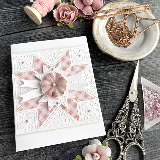
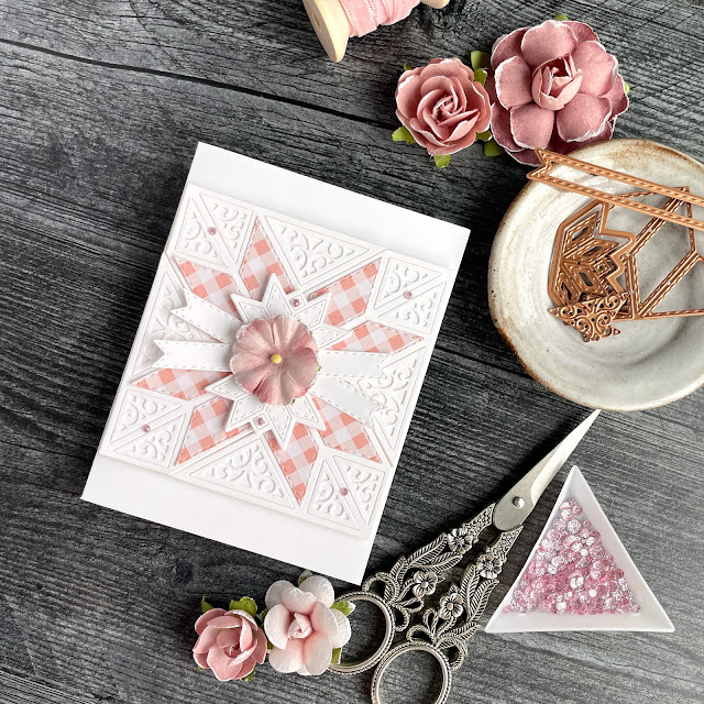
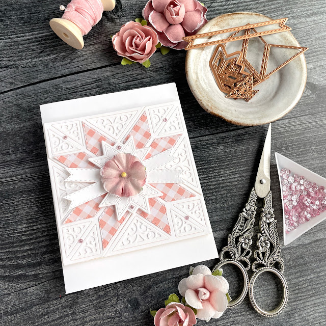
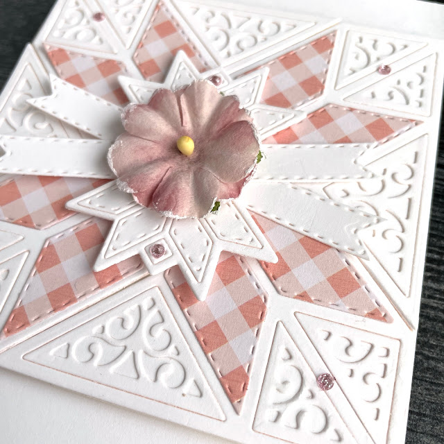
These dies are pretty self explanatory and so are the cards. For the Filigree 8 Point Star card, I went with the pastel motif so I could use a bunch of the filigree dies. I selected a pink gingham from the Boho paper pad for the center star. I used the banner die in the set that could be used for stamping a sentiment on, to back the paper flower I added from Prima, creating an additional star affect.
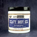
For adhesives, I used a liquid adhesive for the different internal and filigree parts of the die cuts and used foam adhesive to pop up the center star portion and flower as well as the entire square piece from the base of the card. My favorite adhesive for flowers, however, is heavy body gel. It's strong enough to really hold those flowers in place, even through the mail! I then added some of the new Glitter Drops in blush from Pinkfresh for a bit of sparkle.
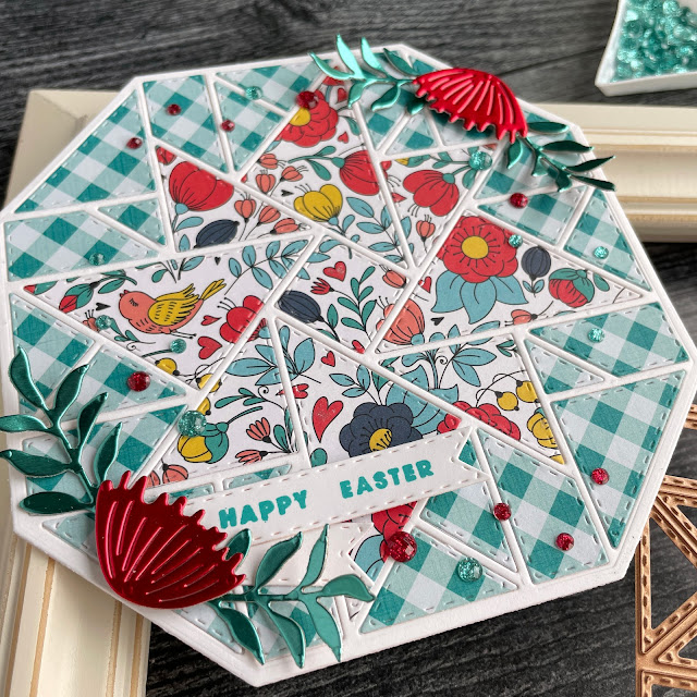
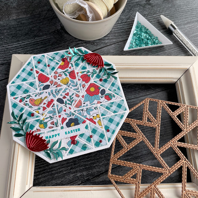
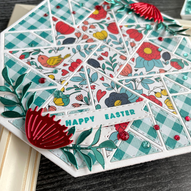
For the Layered Windmill card, I went with the riot of color for a more traditional quilt vibe. I chose two papers from the Playful paper pad--a floral and a teal gingham pattern. I also used the base die to cut the card base. To do this, fold a piece of cardstock in half and then place the die over it, ensuring that the die does not cut through the folded edge. I then cut another single layer of this base die to layer on top of the front. All of the little pieces of this die cut got glued down with a liquid adhesive. For a little bit of glitter, I used the Clear Glitter Brush Marker on the little hearts in the floral pattern.
For decoration on this card, I used the recently released Sealed Wildflowers die and cut some leaves and flowers out of some Tim Holtz metallic kraft cardstock. I shaped the leaves with my fingers and the flowers got popped up with foam adhesive. Under one of the flowers, I tucked a stamped sentiment using Distress Oxide in peacock feathers and the Celebrate Expressions stamp. I stamped this sentiment onto the banner die from the Filigree 8 Point Star set, snipping the excess off with a small pair of scissors. For this card, I added some Pinkfresh Glitter Drops in aqua and ruby.
And that's it! I hope you enjoyed my look at whether to add lots of color or to keep your palette simple as well as my quick tutorial for both cards. There are a lot of really pretty dies in this collection and it's definitely worth checking them all out and picking up your favorites! Until next time, happy crafting!
Adrienne
Shop the Supplies:
I am an affiliate with Spellbinders and Scrapbook.com. When you shop the links below, I receive a small commission from the affiliate, at no additional cost to you. This helps me balance the costs of the time and love I put into my projects and blog so I can continue to share my ideas with you for FREE. If you shop the links, thank you! I greatly appreciate it.
Below are products that I used or similar products.









0 comments
I'd love to hear your thoughts!