How to Use Color Strategically in Your Scrapbook Layouts
I love color. And it's not just because it makes your scrapbook layouts pretty. But because it has the ability to convey emotions and draw out important details in photos.
When I go about creating a scrapbook layout, I don't just pick out cute themed papers or pull out my current favorite collection. I take a look at the photo first. What is the emotion in the photo? Are there any colors in the photo that I wish to highlight? I even consider color in a scrapbook layout even when a photo is black and white or sepia toned.
I believe that when we take color into account on a scrapbook page, we really tie the whole page together. It give the page a cohesive feel and look.
1 | Highlight a Color in Your Photo
One of the easiest ways to use color strategically in your scrapbook layout is to highlight a color or colors in your photo.
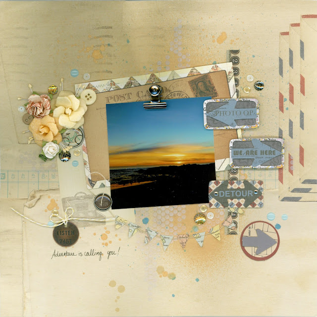
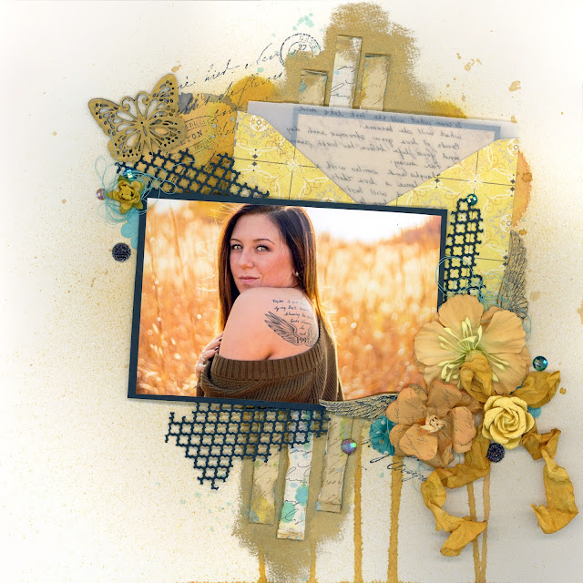
This strategy is one of my favorites for sunset photos. I loved the golden yellow and blue in the photo and found the perfect embellishments and papers to surround the photo with to highlight those brilliant colors in the photo.
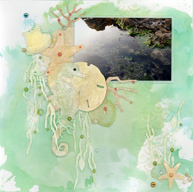
Or perhaps you want to draw out the green of the algae and other sea life in a tidal pool. Pair it with oranges, browns and yellows to draw out color details in the rocks.
Now that we've looked at some ideas for your nature vacation photos, let's take a look at some ideas with people. By choosing to use yellow to match the background of the photo, everything really fades away as the woman in the photo pops out and grabs your attention.
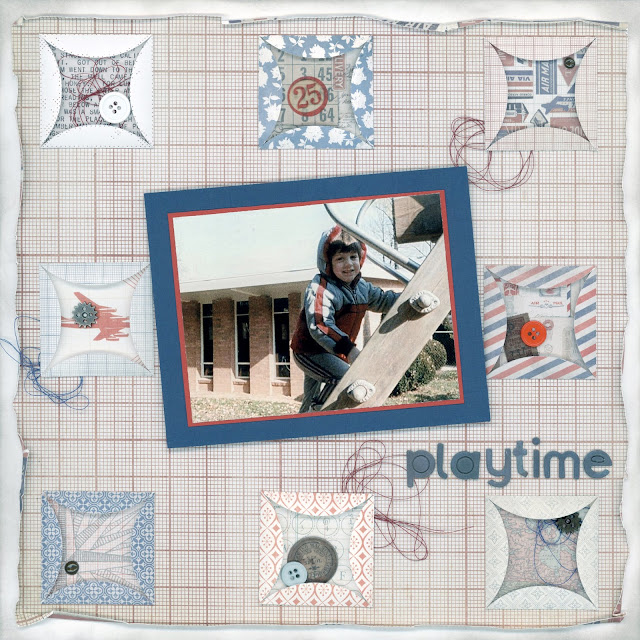
Or, all those vertical windows in the background really stand out until you use colors in the child's coat to draw your eye to the most important part of the photo. This is a really handy tip when scrapping older candid family photos where a busy background can't be helped or isn't thought about in the moment the photo was snapped.
2 | Use the Rainbow Spectrum
There are two times when using all the colors of the rainbow can be really advantageous to your scrapbook layouts.
The first is probably pretty obvious and that is when there is an actual rainbow in your photo. For this layout, I put the colors in color order around the photo, starting with red in the upper left and moving counterclockwise until I ended with violet just above the center of the photo.
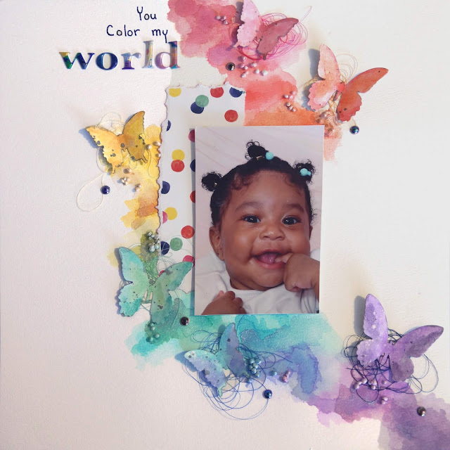
Another way I like to incorporate a rainbow of colors is when the photo is mostly neutral colors. This allows me to really amp up the page with pops of color and some whimsy--perfect for photos of babies and children.
3 | Make Black and White Photos Pop
Black and white photos are great for really bringing out details in photos because it allows your eyes to focus on what is in the photo without the distraction of color. Sometimes I change photos to black in white when I find there are so many colors in the photos it's distracting and chaotic.
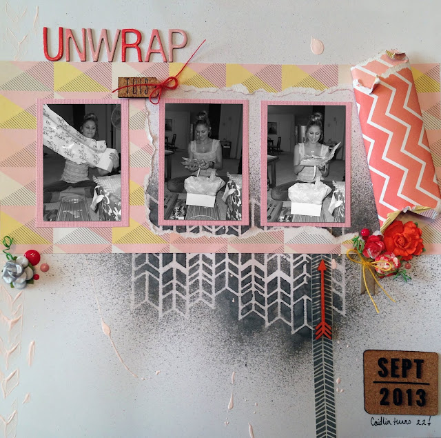
There are times when maybe you want your layout to be a stark contrast in black and white. But for these birthday photos, it's all about a celebration. Here, the color, or lack of color is meant to evoke a mood. These bright pops of color provide a colorful background that really draws your eyes into the triptych of photos while portraying the happy mood of a birthday celebration.
4 | Absence of Color
White space is important in designing your layouts too!
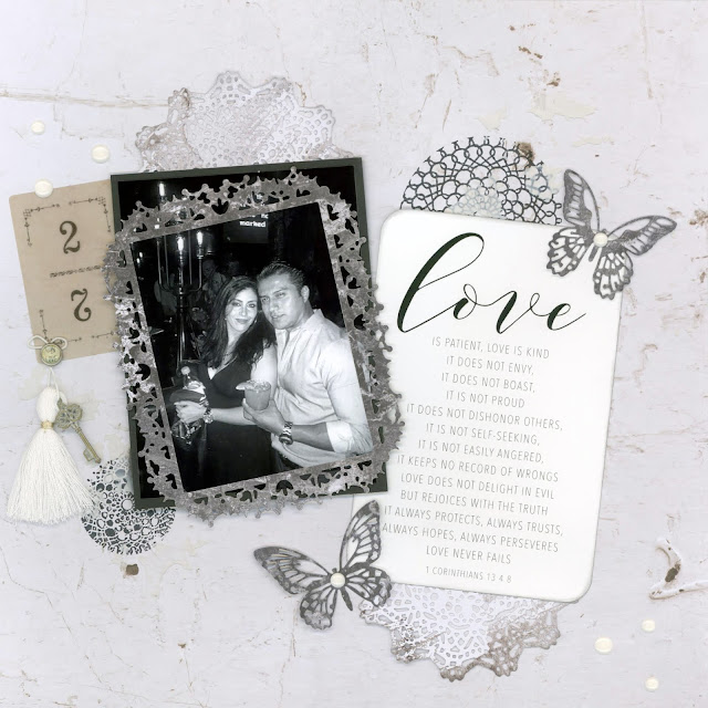
As mentioned above, sometimes you want the timelessness of all black and white or to evoke a mood with that stark contrast. This photo from a client came to me in color but I found some of the people in the background very distracting. I didn't want to crop the photo though because of the really awesome light fixture. So I changed it to black and white with some adjustments. Because this layout is about love, I wanted it to keep that timeless look (because love is timeless!) and stuck with black and white with a few touches of cream and gold.
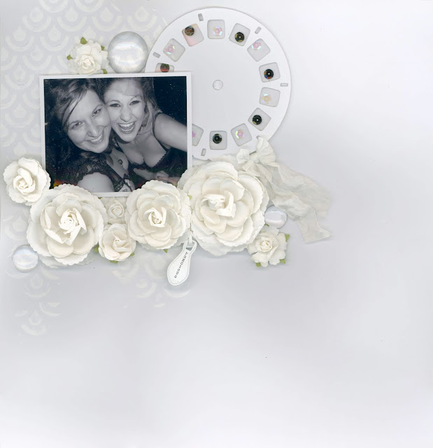
That black and white can go even starker. In this halloween photo layout, I let the photo stand out by designing nearly the entire page in white. This allows you to really focus in on the photo because of the copious amounts of negative white "space."
5 | Colors Important to the Larger Story
There are times when color can be important to the larger story behind the photo, such as wedding colors, a child's favorite color or a sports team color.
The neutral hues in the photo really allowed for the use of the bride's chosen wedding color pallet to be incorporated into this save the date layout.
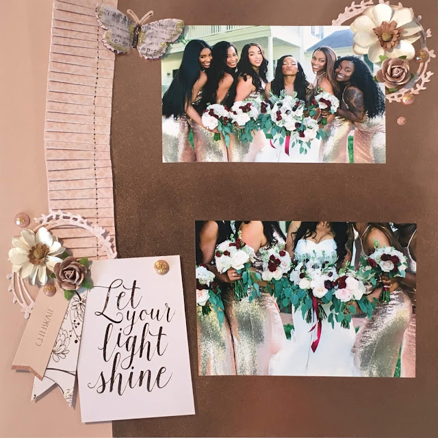
This bride's color pallet was blush pink, rose gold and gold. All of her bride's maids were in rose gold sequin dresses so choosing metallic rose gold paper with pops of blush pink and cream gave a cohesive look to the layout. When creating wedding albums, try using the wedding colors throughout all of the scrapbook pages for an even more cohesive look.
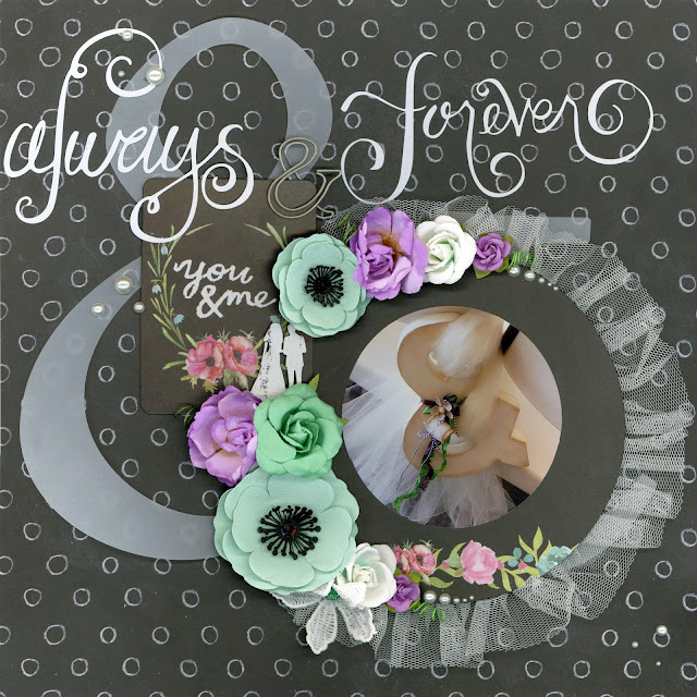
This bride chose shades of green, purple and hints of blush pink for her wedding. To really make the wedding colors pop, try placing coordinating embellishments on a black background, such as in this layout.
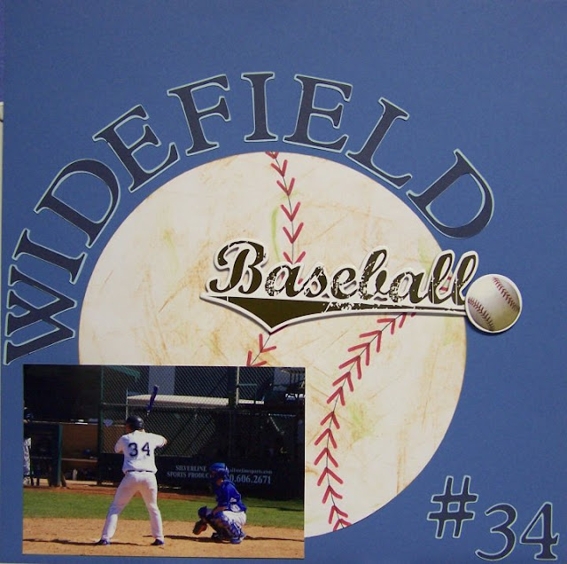
Incorporating team colors into photos of your kid's games can ground the layout. This team's colors were Columbia blue, sky blue and white.
6 | Utilizing the Color Wheel
Picking out different color combinations from the color wheel can also be helpful in deciding on your photos.
I usually start by picking out the main color I want to highlight from the photo or the color I want to use to evoke emotion and co from there.
The top left layout is an example of using complementary colors, colors that are opposite one another on the color wheel. For that layout I choose blue as my main color and then used highlights of yellow, the complimentary color.
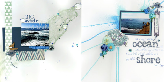
The top right layout is an example of monochromatic. I went with blues that evoke a beachy mindset, including light blues, deep blues and even a few teals.
The bottom left layout is an example of triadic colors, which is three colors evenly spaced on the color wheel. My main color was a pale yellow. The other two colors in this scheme are pastel pink and blue--perfect for a layout featuring two sisters.
The bottom right is an example of analogous, or using three colors that are side-by-side in the color wheel. For example green, blue and purple are an analogous color scheme on a simple color wheel. But so is green, teal and light blue on a more complex color wheel.
To help you choose a color scheme and know what colors you should use, check out Canva's handy color wheel tool.
7 | Evoking emotion
We've touched a little on evoking emotion with color but let's dive a little further into it. Colors are often associated with emotions. Red evokes passion or love, yellow and orange are happy and bright while purple is the color of royalty. Blue is a relaxing color and green harkens you to nature.
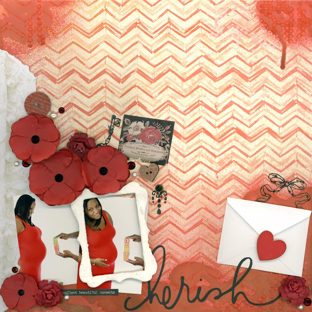
Not only does the red in the layout match the pregnant mother's dress, but it really draws on that emotion of love between a mother and her child. Add pops of secondary and tertiary colors (in this case black and white), to break up the large block of red colors.
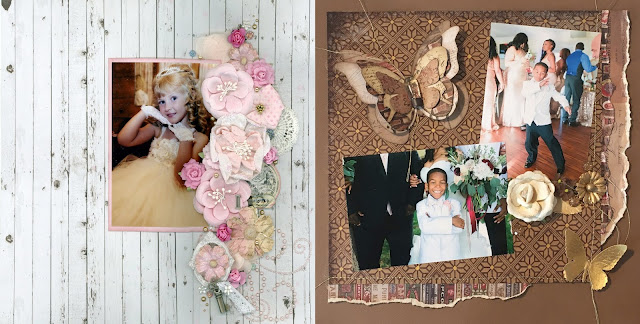
These photos of a flower girl and the young best man can play naturally into more traditional gender color roles, if that is something you wish to do. Because the flower girl is wearing a frilly dress of tulle and ribbon flowers with lace gloves and a tiara, it was perfect for a layout that brings out a feminine quality using plenty of pink flowers. The young best man with his cool dance moves and his strong stance in the second photo lended itself well to a more masculine vintage look with shades of brown and touches of gold. However, since this was still for a wedding album, I added some unexpected elements of femininity to the page in the shapes of the butterflies and the use of flowers, adding to the feeling of elegance that weddings bring.
I believe color is a powerful tool in our arsenal as artists and creators and I hope you learned some new tips on using color more strategically in your own layouts. And once you have your color scheme in hand, check out Scrapbook.com's handy color matching tool to find the right products for your project.







0 comments
I'd love to hear your thoughts!