I find inspiration in some of the strangest places. But I always think it makes for more creative projects in the end.
There's this really lovely piece that my flute quartet, Skylark, had been rehearsing pre-pandemic titled
Harmony in Blue and Gold by Eric Ewazen. This titular impressionistic piece for advanced players is full of lush harmonies using moods and texture to portray a scene. The piece was inspired by the Blue and Gold room, or more commonly known as the
"Peacock Room" because of the large fighting peacock motif on one of the walls.
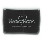
It was that lush combination of deep blues and metallic that lead me to making this card for a friend (who happens to be an oboist)! I wanted a very royal blue in this case, so I chose the new
Prize Ribbon Distress Ink (though I must admit, I think I'll try this combo with Peacock Feathers next). And for the copper, I chose Ranger's
Super Fine Embossing Powder in Copper.
I started out by inking up the
Floral Outline stamp from Tim Holtz with embossing ink (after using a static pad on a piece of
white cardstock--definitely a must for a cleaner look), stamping the image in two of the four corners. I then embossed the stamped image with the copper embossing powder. I really love how the thin lines in the stamp stay true with the super fine embossing powder!
Next I squished some Prize Ribbon ink on my glass media mat then used a
water brush marker to start coloring it in. I started in the center of each flower, working my way out. I would let each layer dry then start in the center again and work my way out but not all the way to the edge of the flower. I kept layering until I was happy with the concentration of color.
I also added some color to the leaves as well, using the same technique on some of the larger ones that I used on the flowers. When this was dry, I loaded up a regular paintbrush brush with watery ink and splattered the card with a little bit more ink for a truly watercolor effect. Then, using the Scrapbook.com
Inspirational Word Dies, I cut out the word inspire from Tim's rose gold colored
metallic kraft stock. I used my Magic Mat with my Vagabond to get a nice clean cut. I glued this down to the front of the card with a little bit of matte Collage Medium.
I hope you found this card inspirational as well (I couldn't resist)! Until next time, happy crafting!
Adrienne
Shop the Supplies:
ReplicaSurfaces
Love the background I shot my photos on? It's from Replica Surfaces, a company that makes rigid photo-realistic backgrounds. This surfaces are called Shiplap and Special Edition Gloss White. You can pick up your own with a 15% discount by shopping this link. When you do, I get a small commission from the sale at no extra cost to you, which helps me continue to provide you amazing tutorials and information, just like this blog post!
Scrapbook.com
I am an affiliate with Scrapbook.com. When you shop the links below, I receive a small commission from the affiliate, at no additional cost to you. This helps me balance the costs of the time and love I put into my projects and blog so I can continue to share my ideas with you for FREE. If you shop the links, thank you! I greatly appreciate it.
Below are products that I used or similar products.


No comments:
Post a Comment
I'd love to hear your thoughts!